Motivation
If you’re starting off with Python visualization, you may be overwhelmed with the number of libraries and examples:
- Matplotlib
- Seaborn
- Plotly
- Bokeh
- Altair
- Folium
If you have a DataFrame waiting to be visualized, which one should you pick? Some libraries might be better in specific cases than the others. This article will show the pros and cons of each. By the end of this article, you should be able to distinguish the different features of each library and have an easier time choosing the optimal one.
We will do this by using a sample dataset and exploring it using each library, focusing on a few specific attributes:
Interactivity
Do you want your visualization to be interactive?
Some libraries, such as Matplotlib, render visualizations as images; thus, they are good for explaining concepts (in a paper, slide deck, or presentation).
On the other hand, libraries like Altair, Bokeh, and Plotly allow you to create interactive graphs that your users can dive into and explore themselves
Syntax and Flexibility
How does the syntax for each library differ? Lower-level libraries such as Matplotlib let you do anything you could conceivably want — but at the cost of a more complex API. Some libraries such as Altair are very declarative, which makes it easier to map to your data.
Type of data and visualization
Are you working with a specialized use-case, such as a geographical plot, with large data, or using a plot-type which is only supported by a certain library?
Data
To make it easier to compare, I will use the real data I scrape from Github in this article:
If you want to follow the article, you could either download the data here
Or get the direct data from Datapane Blob.
import datapane as dpdp.Blob.get(name='github_data', owner='khuyentran1401').download_df()
Remember to log in to Datapane with your token beforehand if you want to use the Blob. This should take less than 1 minute
Matplotlib
Matplotlib is probably the most common Python library for visualizing data. Everybody who is interested in data science has probably used Matplotlib at least once.
Pros
- Easy to see the property of the data
When analyzing data, having a quick look at the distribution may be ideal.
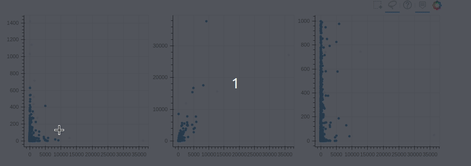
For example, if I want to have a quick look at the distribution of the top 100 users with the most followers, using Matplotlib is usually enough.
Even though the x-axis of Matplotlib does not look good, we have a better understanding of the distribution of the data by looking at the graph.
2. Can Plot anything
Matplotlib is very versatile, which means it can plot any kind of graph you could imagine. The Matplotlib’s website contains very comprehensive documentation and various graphs in the gallery, which makes it easy to find tutorials for any crazy plot you can think of.
Like some text like this:
Cons
Matplotlib can plot anything, but it may be complex to plot non-basic plots or adjust the plots to look nice.
Even though the plot is good enough to visualize the distribution, if you want to represent your data to others, you will need to fix the x-axis, y-axis, which takes a lot of effort. This is because Matplotlib has an extremely low-level interface.
Takeaway: Matplotlib can plot anything but complex plots might take much more codes than other libraries
Seaborn
Seaborn is a Python data visualization library based on Matplotlib. It provides a higher-level wrapper on the library which makes it easier to use.
Pros
- Less code
It provides a higher-level interface for similar plots. In another word, seaborn generally provides similar plots as matplotlib, but with less code and a nicer design.
We use the same data as before to draw a similar heatmap of the graph.
We get a better heatmap without setting the x and y label!
2. Make common-used plots prettier
Many people opt for seaborn when it comes to popular plots such as bar plot, box plot, count plot, histograms, etc not just because they could be created with less code but also they look much prettier. As we can see in our example above, the colors also look better than the defaults one of Matplotlib.
Cons
Seaborn is more constrained and does not have as wide a collection as matplotlib
Takeaway: Seaborn is a higher-level version of Matplotlib. Even though it does not have a wide collection as Matplotlib, seaborn makes popular plots such as bar plot, box plot, heatmap, etc look pretty in less code.
Plotly
Plotly’s Python graphing library makes it easy to create interactive, publication-quality graphs. It can also create similar charts as Matplotlib and seaborn such as line plots, scatter plots, area charts, bar charts, etc.
Pros
- Like R
If you are a fan of plots in R and miss its features when switching to Python, Plotly gives you the same quality plots using Python!
My favorite is Plotly Express because it makes it really easy and it is even faster to create great plots from a single line of Python.
2. Easy to create interactive plots
Plotly also makes it easy to create interactive plots. Interactive plots are not only pretty but also make it easier for viewers to take a closer look at each data point.
Remember the bar plot we have earlier with matplotlib? Let’s see how it turns out with Plotly
With about the same lines of code, we produce an interactive plot that we could hover your mouse over each bar to see what user and the number of followers the bar represents. This means the consumer of your visualization can explore it themselves.
3. Complex plots made easy
With Plotly, some plots that are usually challenging to create can be created easily.
For example, if we wanted to create a map to visualize the locations of Github users, we can find their latitudes and longitudes as shown here, and then use that data to spot the locations of users on the map like this
With a few lines of codes, the locations of all users are beautifully represented on a map. The color of the bubbles represents the number of forks and the size represents the total number of stars
Cons
Even though Plotly supports a variety of plots, there is still a lack of some common plots
For example, while seaborn has sns.countplot() to count the number of occurrences of a category in the data, Plotly does not have count plot. So we need to perform groupby in advance to group the data by class.
We need more code to create the count plot and the plot does not show up as automatically colorful as the one of seaborn.
Takeaway: Plotly is great to create interactive and publication-quality graphs with few lines of code. However, for some simple plots such as count plot, it can be simpler to use seaborn
Altair
Altair is a declarative statistical visualization library for Python based on vega-lite, which makes it ideal for plots that require a lot of statistical transformation.
Pros
1. Simple visualization grammar
The grammar used to create the visualization is easy to understand. It needs to only mention the links between the data columns to the encoding channels and the rest plotting is handled automatically. This sounds abstract but is a big deal when you are working with data, and it makes visualizing information really fast and intuitive.
For example, with the titanic data above, we would like to count the number the people in each class, all we need is to use count() in the y_axis
2. Easy to Transform Data
Altair also makes it really easy to transform the data while creating the chart
For example, if we would like to find the average age of each sex in the titanic, instead of doing the transformation in advance like Plotly, we could perform the transformation within the code to create the chart.
The logic here is to use transform_aggregate() to take the average of the age (mean(age)) of each sex ( groupby=[‘sex’] ) and save the average to the variable mean(age). We take this variable as the y_axis.
We could also make sure that the class is a nominal data (categorical data without any order) using :N or make sure the mean_age is a quantitative data (measures of values such as numbers) using :Q
See a full list of data transformations here
3. Easy to Link Plots
Altair also allows you to do some impressive linking between plots such as using an interval selection to filter the contents of an attached histogram.
For example, if we want to visualize the number of people in each class within the interval we select a point chart between age and fare, we could do something like this.
As we drag our mouse to select the interval within the scatter plot, we could see the change in the bar chart below. When combined with the transforms and calculations from earlier, this means you can create some extremely interactive plots which do on-the-fly calculations — without even requiring a running Python server!
Cons
Unless you specify custom styling, the simple charts such as the bar chart do not look as styled as seaborn or Plotly. Altair also does not recommend datasets with above 5000 samples and instead recommends that you aggregate your data prior to visualization.
Takeaway: Altair is ideal for sophisticated charts to show statistics. Altair cannot handle data above 5000 samples and some simple charts do not look as styled compared to Plotly or Seaborn.
Bokeh
Bokeh is a flexible interactive visualization library that targets web browsers for representation.
Pros
- Interactive version of Matplotlib
If we will rank among the interactive visualization libraries above, Bokeh will probably rank first in regards to the similarity to Matplotlib.
Matplotlib can create any plot because it is a low-level visualization library. Bokeh can be both used as a high-level or low-level interface; thus, it can create many sophisticated plots that Matplotlib creates but with fewer lines of code and higher resolution.
For example, the circle plot of Matplotlib
Could also be created with better resolution and more utility using Bokeh
2. Link between Plots
Bokeh also makes it really easy to link between plots. The change applied in one plot will be applied to another plot with a similar variable.
For example, if we create 3 graphs side by side and want to observe their relationship, we could use linked brushing

ColumnDataSource
enables the data to be shared among plots. Thus, when we apply the
change to one plot, the other plots are also changed accordingly.
Cons
Because Bokeh is a library that somewhat has a middle-level interface, it often takes less code than Matplotlib but takes more code to produce the same plot as Seaborn, Altair, or Plotly.
For example, to create the same count plot using titanic data, besides the need of transforming the data in advance, we also need to set the width of the bar and color if we want out the graph to look nice
If we didn’t add width for the bar graph, the graph would look like this
Thus, we need to manually adjust the dimensions to make the plot nicer
If you want to create a nice bar plot in less code, this might be the drawback of Bokeh compared to other libraries
Takeaway: Bokeh is the only library whose interface ranges from low to high, which makes it easy to produce both versatile and elegant graphics. This, however, comes with the cost that it generally takes more code for Bokeh to create the plots with a similar quality to other libraries.
Folium
Folium makes it easy to visualize data on an interactive leaflet map. The library has a number of built-in tilesets from OpenStreetMap, Mapbox, and Stamen
Pros
- Easy to create a map with markers
Even though Plotly, Altair, and Bokeh also enable us to create maps, Folium uses an open street map to give you a closer feeling to a Google Map with minimum code
Remember how we create the map to visualize the locations of Github users using Plotly? We could make the map look even nicer with Folium
The initial location in Brooklyn, NY. Zoom out to see other locations on the map. With some lines of codes, we have created a real map showing the locations of users.
2. Add potential location
If we want to add potential locations of other users, Folium makes it easy to do by allowing users to add markers
Click on the map to see a new location generated right where you click.
3. Plugins
Folium has a number of plugins you can use with your map — including a plugin to Altair. What if we want to see the heat map of the total stars of Github users in the world to identify where there is a high number of top Github users with a high number of the total stars? The heatmap in Folium plugins allows you to do just that.
Zoom out to see the complete picture of the heatmap.
Takeaway: Folium allows you to create an interactive map with few lines of codes. It gives you close to the experience of a Google Map.
Conclusion
Congratulation! You have just learned about six different visualization tools for your visualization. I hope this article gives you a sense of what each library does and when to use what. Grasping the key features of each library will make it faster for you to pull out the right library as you need.
If you are still confused about which library to use for your data, just pick one that you find good enough. Then if the code is too long or the graph does not turn out as good as you imagine, just try with another library!
Check out this gallery for more inspirations on the visualization tools mentioned in this article. Sign up on Datapane to get access to the data I use in my articles
I like to write about basic data science concepts and play with different algorithms and data science tools. Follow me on Medium to get updated about my latest articles.
Find me on the Artist of Data Science Podcast or check out my other blogs on data science topics:
Comments
Post a Comment